


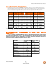

VIZIO GV47L FHDTV20A User Manual
Version 4/23/2008 40
www.VIZIO.com
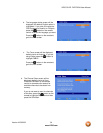
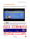
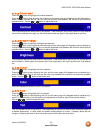
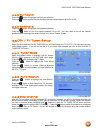
4.2.3 Contrast
Press the button to highlight the Contrast selection.
Press the button to start adjusting the contrast and the menu page will disappear and be replaced by a
small Contrast Indicator Bar so you can see the contrast level between the minimum and maximum
available levels. Use the or button to adjust the level.
The Contrast adjusts the white levels in the picture. If the contrast is too low the picture will look washed
out and if the contrast is too high you will not be able to see any detail in the bright parts of a picture.
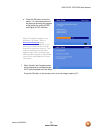
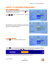
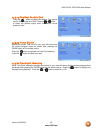
4.2.4 Brightness
Press the button to highlight the Brightness selection.
Press the button to start adjusting the brightness and the menu page will disappear and be replaced by
a small Brightness Indicator Bar so you can see the brightness level between the minimum and maximum
available levels. Use the or button to adjust the level.
The Brightness adjusts the black levels in the picture. If the brightness is too low you will not be able to
see the detail in darker parts of the picture and if the brightness is too high the picture will look washed
out.
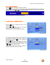
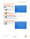
4.2.5 Color
Press the button to highlight the Color selection.
Press the button to start adjusting the color and the menu page will disappear and be replaced by a
small Color Indicator Bar so you can see the color level between the minimum and maximum available
levels. Use the or button to adjust the level.
The Color adjusts the amount of color in the picture.
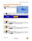
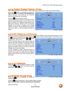
4.2.6 Tint
Press the button to highlight the Tint selection.
Press the button to start adjusting the tint and the menu page will disappear and be replaced by a
small Tint Indicator Bar so you can see the tint adjustment to the left or right of the nominal position.
Use the or button to adjust the level.
The Tint adjusts the hue of the picture. The easiest way to set tint is to look at flesh tones and adjust for
a realistic appearance. In most cases, the default middle position is correct. If people’s faces look too
orange try reducing the level of color first as the case of this is often too much color.