E-61
Appendix
c. Set-Up
When giving a presentation, you need to set the stage both
figuratively and literally for success. The way you set up a
presentation room will have a great impact on the audience’s
perception of you and your message. By manipulating the
placement and use of the following tools, you will improve the
impact of your presentation.
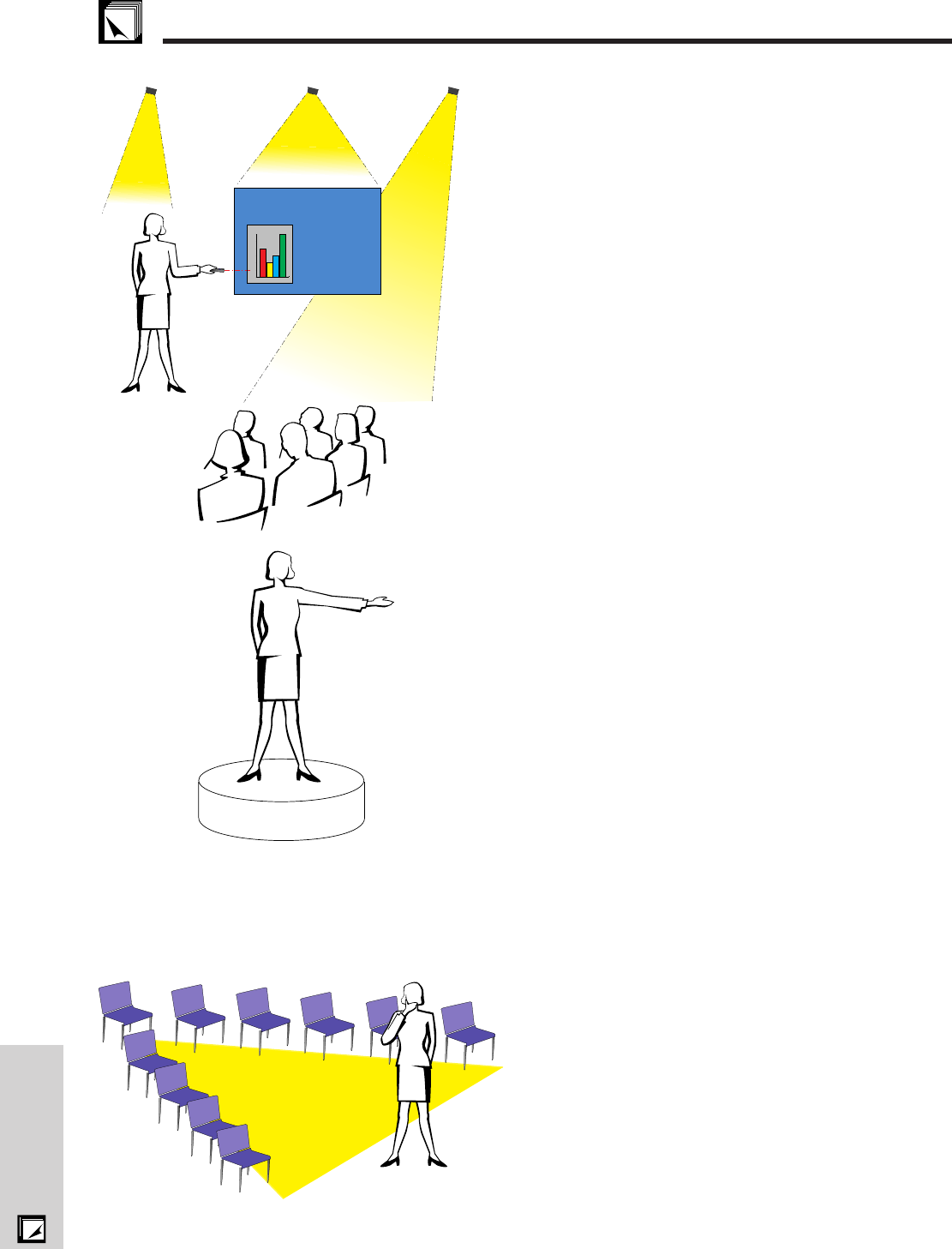
Lighting—Good lighting is an important component of a
successful presentation. You should strive to create an unequal
distribution of light. An audience should always see as much
of the presenter’s face as possible, so most of the light should
be focused on you. Because it is important for you to be able
to read the audience’s faces and body language, some light
should be shed upon them. However, no light should shine
on the screen.
Stage— When presenting on the same level surface that your
audience is on, most people can only see the top one-third of
your body. Therefore, it is recommended that when giving a
presentation to an audience of 25 or more, you stand on a
stage or platform. As more of your body is visible, the easier
it is to communicate with an audience.
Podiums—The best presenters avoid podiums because they
hide 75% of the body and restrict movement. However, many
people feel more comfortable with a podium to hold their notes
and hide their discomfort. If you must use a podium, angle it
at 45 degrees to the audience so that you are not completely
hidden.
Visuals—It is imperative that you make sure your visuals are
large enough and projected far enough for the audience to
see. Eight times the height of an image is the optimal viewing
distance to read 24 point type. The bottom of a screen should
be at least 6Ј (1.8 meters) above the floor.
Screen—The screen should always be in the center of the
room so that all audience members can see it. Because people
read from left to right, you should always stand to the
audience’s left when discussing visuals.
Seating—Arrange seating according to the dynamics of your
presentation. If the presentation is more than half-a-day, use
classroom style seating—a chair and a desk. If you would
like to encourage audience interaction, use chevron seating,
angling the chairs into a “V” shape. When you have a very
small audience, a “U” shaped arrangement will increase
interchange.
Good Bad Good
Presentation from SHARP
0
5
10
15
20
25
30
Guide to Effective Presentations
