


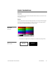


152 Color Guidelines Color Active-Matrix LCD Touch Panels
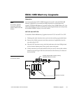
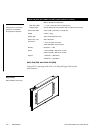
• Avoid using adjacent colors or background shades. When you use the same
colors or shades, the objects or text may be hard to see or read. The example
in Figure 204 shows good and bad contrasts.
Bad contrast
Good contrast
• Do not use bright or intense colors for buttons that display for long periods
of time. The brighter the colors, the more fatiguing to the eyes. Limit the use
of bright colors to show feedback.
• If you use a graphic on a button, either make the button the same as the
background on the graphic or change the background color of the graphic to
match the button.
Figure 204
Background shade example